Project:
My Space
About
-
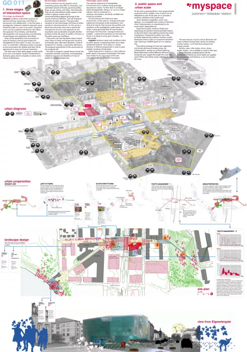
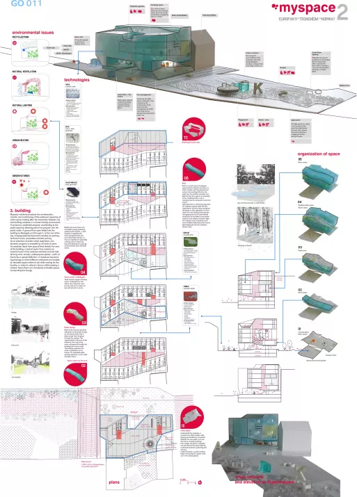
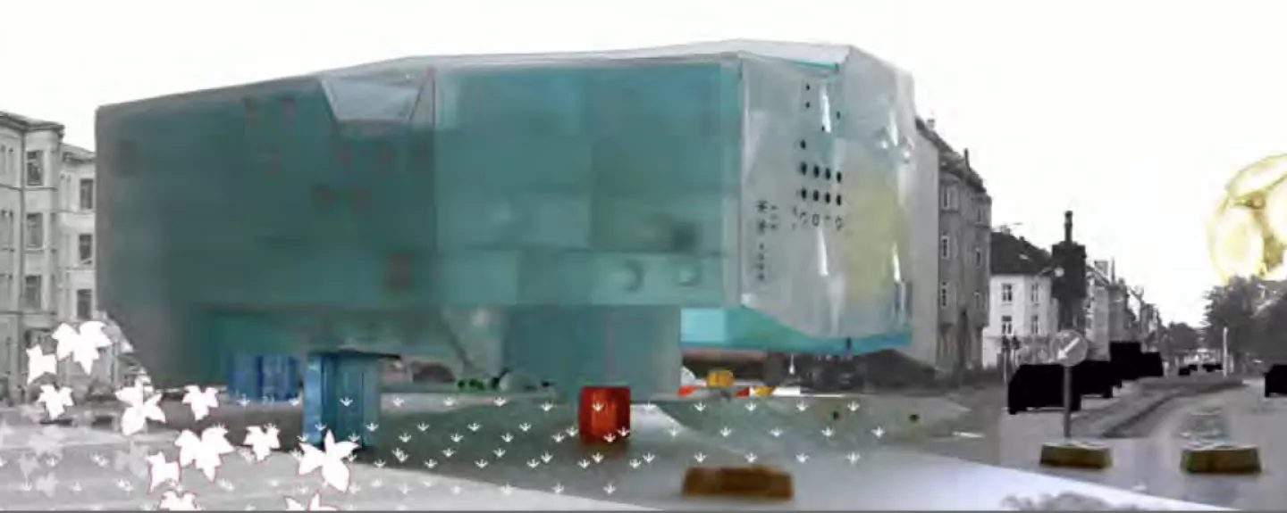
MySpace residence proposes the condensation, transfer and conditioning of the relational capacities of urban space, looking after the interaction between city and building residents in a winter friendly environment.
A temporary residential program contributes to the public space by dissolving part of its program into the public realm. a ground floor open lobby links the building to abelsgate and through it, to the rest of the city. a topography-like basement includes car parking, technical rooms, wardrobes and bike parking.
Non domestic program is accesible by all kinds of users as an extension of public urban experience.
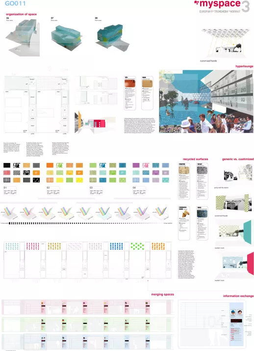
the interior barely differs from the exterior: an escalator leads from ground level directly the core of the building, a central sector that contains an important part of the collective activities (concert hall, dinning room, laundry, multipurpose spaces...) with no hierarchy or spatial definition. It is a mixed-use two-story hyperlounge in which different ambiances are located, an elevated square where to eat while waiting for the laundry, or where to attend a lecture while roasting a chicken. room floors are introduced as flexible spaces sorrounding this lounge.
the building replicates the urban organization on its interior, an expanded public uprising sequence, a tree made of public events.
Besides the usual clean and renewable energy- producing systems, each resident is supplied with micro-aerogenerators and micro-fotovoltaic devices, so they are capable of responsibly manage natural resources, thus participating of a synergy of collective and individual action.
Light becomes an activating argument for collective spaces. Both the plan organization (several strips occupying the space as they approach or move away from the existing limits giving a changing space full of intermediate situations) and the slided cross section captures and reflects horizontal light. an irregular array of synthetic and mirror bubbles help horizontal natural light deeply get into the residence darker areas.
Small terraces appear between rooms. protected from the others view, they host more private uses such an open air spa with jacuzzi or sauna.
The roof is a small natural landscape captured from distant mountains, in direct relation with the physical and natural sorroundings (the city, the night sky, the weather and open air). roof can be thus used as an extension of the residential offer, even a camping area for temporal uncommon events.
Underneath the residence, a covered area offers shelter while keeping permeable the connection between the new public axis and the future univesity buildings. Like a stage, the plaza is elevated over the level of the street offering a multimodal place for gathering and sharing.
Halfway between the participation in a restricted community and the generic city, residents can link to each other by real or virtual means. MySpace community is built trough exchanges, in a similar way as the residence building. each room reproduces itself the building’s internal scheme: functional bands, having each one a fixed part and a customizable zone, and participative collective ambiances. each room has a small elevated use space which act as a functional and atmospherical intimacy membrane. a gimnasium?, a greenhouse?, a summer bedroom? a library? Just a generic space waiting to be customized. this singular area is glass enclosed to insulate the room. Since there are two glass layers, residents have the chance to shut both of of them, leaving just one open or wide openning both.
Rooms are microscapes. the landscape, the city and the residence itself have a place inside each room. On the contrary, residents may find their room elsewhere: my city is my room, my residence is my room, my Blackberry is my room... mySpace is my room!
As interfaces between urban space and the shared spaces of the residence, rooms are provided with a double access: directly from the street and entrance from the residence collective areas. this way, residents can decide wether to interfere or not with the rest of residents (norwegian statistics of students habits show 52% living alone, 47% sharing appartment and only 1% living with family).
Storage, centralized waste separation containers, bathroom and a little garden are contained in a functional thick strip that divide the surface. the mini garden occupies an in-between location, as a natural extension of the shower tray, and may be shared by the neighbors as they do in single-family houses that sorround the area.
A garage door shutting the interior front opens according to the users predisposition to add one’s space to the rest of the residence space. a resident’s personal profile manages the front: relevant personal (but not intimate) data about each user, some of them offered directly by themselves (and so susceptibles of being made up such, as in avatars), name, nickname, e-mail, age, studies or residence seniority. Other data are directly given by the residence managers, as an effective way of broadcasting parametres (water and electricity consumption, waste or energy production...) that can improve community awareness and compromise with responsible practices and social sustainability. Other devices such a led display work as a personal announcement board.
-
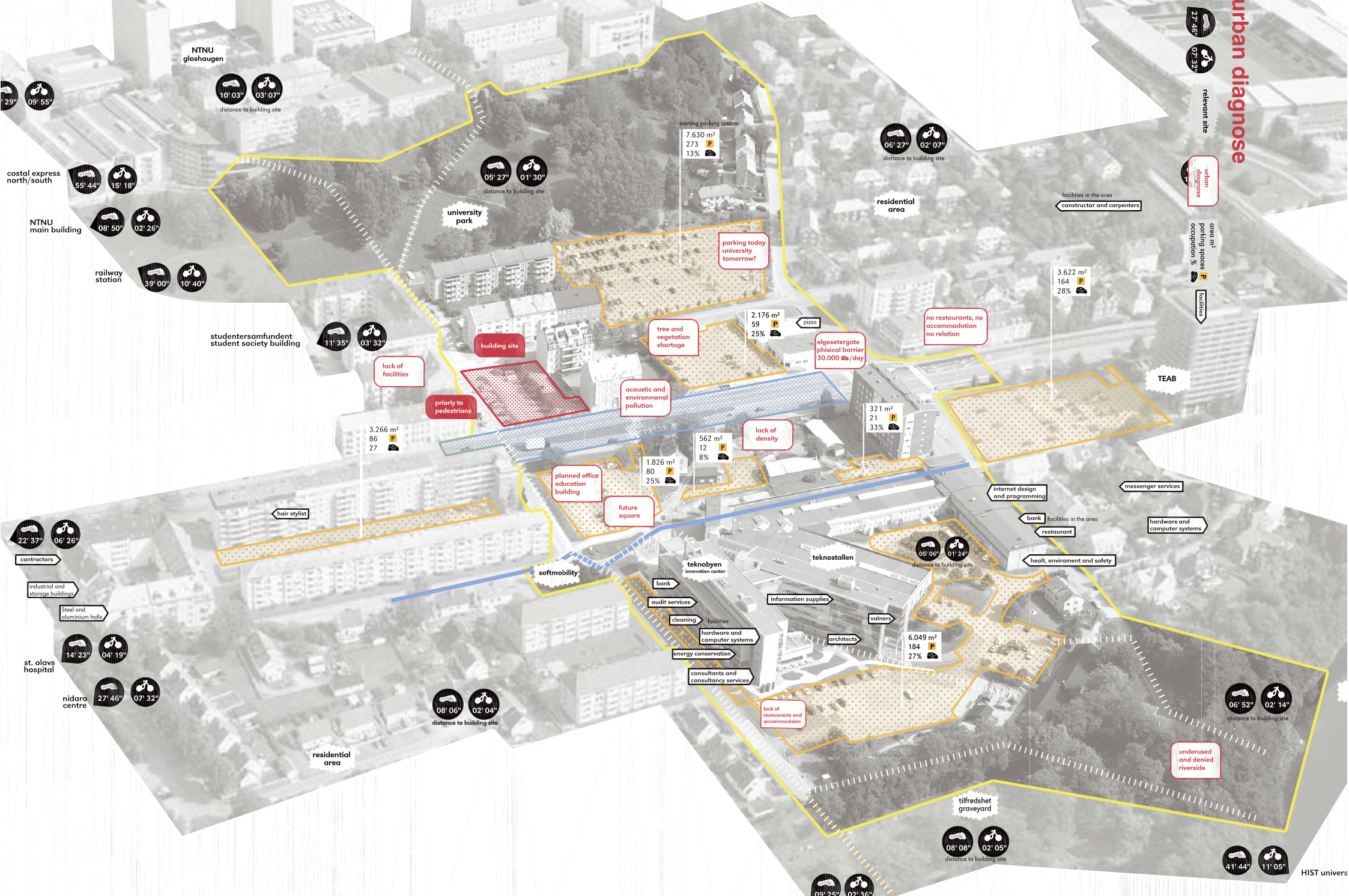
this project has a clear and flexible strategy, a programmatic approach that builds on existing features in the area, adding some simple attractions. the crossing of the street is on a level. the main focus of the project is the building proposal, but although the urban strategy maybe ‘loose’ and could be better developed, it keeps a lots of ideas and promises. the main idea is to extend the public realm into the building by opening up the ground floor, allowing the public through the building right up to the roof deck. the motto “MySpace” refers to a nifty solution for the front elevations of each individual room, where the occupant can display an electronic identity. these identities come together in a kind of giant designer beehive. the organisation of the building is sober, efficient and purposeful, and communicated in a rich and detailed presentation, covering everything from environmental strategies to façade details. this proposal presents a quite compelling solution for the student residence; the idea is based on the continuation of the public realm inside the building, throughout and in between the private student rooms, ending in a public roof deck. the resulting spatial and programmatic organization looks convincing and exciting. the architecture might look clumsy from certain angles, but in general the authors show a very high degree of control in space forming. On the other hand, the urban approach in this proposal must also be prioritized. as the programmatic approach is built upon excisting features in the area, it just put in some additional attractions. the urban situation is kept and developed by a large on grade crossing to connect the two sides of the road. the ground floor is underdeveloped but there is a will to establish at least a visual connection between the public street and the courtyard is shown. It seems as the team has everything under control, both plans, sections and details. the brutto/netto factor in the building seems tight, and the project has a soberminded attitude.
-
Clara Murado (ES)
Juan Elvira (ES)
Enrique Krahe (ES)Contact information:
www.muradoelvira.com
Related projects
-
My Space
A temporary residential program contributes to the public space by dissolving part of its program…
-
Blue Axis
Based on the theory that one of the problems of the modern urban strategy is the segregation of…
-
Inside out
Building upon the existing knowledge base and a rapidly developing creative industry, and combined…
